
b&w compositions
- Savannah Frantisak
- Sep 12, 2018
- 2 min read

Updated: Sep 15, 2018
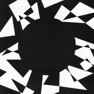
The three designs below each represent a different element of gestalt: continuation, closure, and simultaneous figure/ground.
First, the left composition displays continuation in the form of a pattern of white triangles. Black triangles were placed onto white paper leaving the white lines between each triangle, while also leaving a string of white spaces shaped as triangles. This patter creates movement from the top left corner to the bottom right. This causes the viewers eye to follow the motion from left to right and through the design.
The middle design clearly displays closure. In the center is where the closure is seen, in the shape of a black circle. This effect was created by placing and overlapping white triangles and squares surrounding a circle in the center of the page, and then removing pieces of the shapes that interfered with the shape of the circle. In the small areas where the shapes intersect, the overlaps were cut out to add more of an interesting dynamic. By doing this it can also be seen as closure because while in reality the only thing down on the paper is white shapes touching each other at jagged corners, but it as seen as overlapping shapes because you can see them through each other. This adds an interesting effect, creating more closure than what is happening in the center of the page.
For the third design, the diagonal line crossing the center divides the composition into two halves. The halves are symmetrical across the diagonal line, where multiple center-based squares swap between white and black. It seems that the white half has black overlapping squares, and vise versa for the black half. This composition also displays continuation, by seeming to push the design back into the page and bringing the viewers eye into the center of the page.


Comments